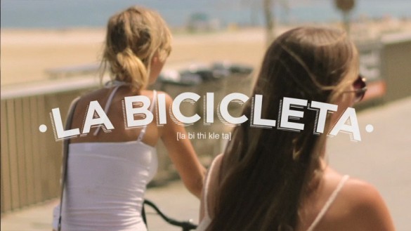
This post is about three different, yet related things that caught my attention recently…
1. Live the language commercials
EF (Education First) released “four short films that will make you want to pack your bags” and travel to Paris, Barcelona, Beijing and London. They got Stockholm based Art director & designer Albin Holmqvist to take care of the beautiful typographic treatment in each video.


I am super excited to be visiting Spain soon, so I decided to post the Barcelona video below, but be sure to take a look at the other three commercials too.
EF – Live The Language – Barcelona
2. Fonts in use
The Fonts in Use project is a great idea and is best explained by editor Stephen Coles:
At Fonts In Use we’ll catalog and examine real-world typography wherever it appears — branding, advertising, signage, packaging, publications, in print and online — with an emphasis on the typefaces used.
![]()
![]()
![]()
![]()
Curious about the fonts used by Holmqvist in the Paris commercial? Look no further, Fonts in Use offers a fantastic analysis.
3. Logotypes for EF destinations
Following the success of his work on Live the Language, Holmqvist was commissioned by EF to create logotypes for each of their 40 destinations worldwide including my home city, Cape Town. Below are a couple of examples, see more in his portfolio at albinholmqvist.com.


warm tingly feelings 🙂
so cool it hurts.
respect!