Skip to content

Typedeck

Exploring the design of the human experience

  • Home
  • About

50 USA state mottos & 10,000 Minnesota lake logos

I recently happened upon two interesting projects sharing several similarities; both are about geographic regions in the USA, both are typographically executed and both are rather ambitious…

I recently happened upon two interesting  projects sharing several similarities; both are about geographic regions in the USA, both are typographically executed and both are rather ambitious…

1. 50 and 50

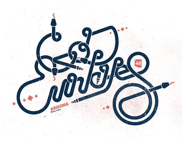
Fifty illustrators from across the United States of America each visually interpreted the motto of their own state. The resulting gallery has a nice cohesive feel thanks to a common duotone palette. I don’t know if there were any other particular guidelines in the brief, but it’s interesting to see that many of them feature similar executions like hand-drawn type, misregistered colours and grainy textures. At a glance one might even assume that they were all done by the same person!

The 50 and 50 project was the idea of Dan Cassaro, the force behind one-man studio Young Jerks in Brooklyn, New York. Judging by the post archive, the project was completed in April 2011. Prints are now available from Society6.

Here are a couple of the more delightful results:

50 and 50 - The state mottos project

50 and 50 - The state mottos project

50 and 50 - The state mottos project

50 and 50 - The state mottos project

50 and 50 - The state mottos project

50 and 50 - The state mottos project

50 and 50 - The state mottos project

50 and 50 - The state mottos project

50 and 50 - The state mottos project

50 and 50 - The state mottos project

50 and 50 - The state mottos project

50 and 50 - The state mottos project

50 and 50 - The state mottos project

50 and 50 - The state mottos project

2. Branding 10,000 Lakes

Nicole Meyer of Minnesota aka The Land of 10,000 Lakes has embarked on an outrageous quest to design a logo for each of the state’s lakes. Why?

Lake logos have a tendency to be, well, fairly ugly. This project was created to rethink what they could be. One Minnesota Lake. One Logo. Every day. Should only take a little over 27 years to hit ’em all.

Follow Nicole’s progress at Branding 10,000 Lakes. Here are a few examples of the 130-odd she has created so far:

Branding 10,000 Lakes

Branding 10,000 Lakes

Branding 10,000 Lakes

Branding 10,000 Lakes

Branding 10,000 Lakes

Branding 10,000 Lakes

Branding 10,000 Lakes

Branding 10,000 Lakes

Branding 10,000 Lakes

Branding 10,000 Lakes

Branding 10,000 Lakes

Branding 10,000 Lakes

Branding 10,000 Lakes

Branding 10,000 Lakes

Share this:

  • Click to share on Facebook (Opens in new window)
  • Click to share on LinkedIn (Opens in new window)
  • Click to share on Twitter (Opens in new window)
  • Click to share on Google+ (Opens in new window)
  • Click to share on Pinterest (Opens in new window)

Related

Author: Imar

Imar Krige is a professional graphic designer and typography enthusiast from Cape Town, South Africa. View all posts by Imar

Author ImarPosted on November 22, 2011November 27, 2017Categories Inspiration, TypographyTags Dan Cassaro, Logo, Minneapolis, Nicole Meyer, NYC

Post navigation

Previous Previous post: Lovely word marks by Kiss Miklós
Next Next post: Trent Walton pushes the boundaries of web type

Categories

  • Life and Work (2)
  • Typography (142)
    • Artefacts (30)
    • Designers (21)
    • Inspiration (40)
    • Noteworthy (36)
    • Resources (15)

Follow

  • Email
  • Facebook
  • Google+
  • RSS: All posts
  • Twitter
  • Home
  • About
Typedeck Proudly powered by WordPress