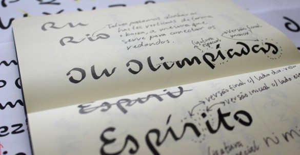
The spirit of “Harmonious Diversity” is captured in this font designed by the Brazilian Dalton Maag team for the for Rio 2016 Olympic Games.
The strong contrast between thick and thin strokes was explored during the design process by putting brush to paper and writing by hand. The variety of the curves in the different letters has a unique informality, inspired by the joyfulness of the Brazilian people.


Here are a few images of the design process:


The letter “r”, inspired by Pedra da Gávea:

Fluid lines, simulating the agility of the athletes’ movements:

The letter “m”, inspired by the Copacabana sidewalk:

Read more at Rio2016.org.